In a previous post we looked at the potential effectiveness of the Pfizer-Biontech vaccine candidate. Today Moderna announced interim results from their study. I have to say that their press release was quite a bit more informative than the Pfizer release.
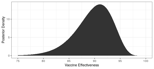
They report that only 5 of the 95 cases came from the vaccine group (94% efficacy!). This allows us to update our efficacy probability plots to include the Moderna vaccine. Recall that due to Pfizer only reporting that efficacy is “greater than 90%,” we don’t know whether that means that the point estimate is greater than 90%, or that they are 95% certain that efficacy is above 90%. For completeness, we will include both of these in our analysis, with “point” indicating that the point estimate is slightly greater than 90%, and “bound” indicating the result if they are 95% certain that efficacy is above 90%. We’ll use the weakly informative prior from the Pfizer study design, though any weak prior will give similar results.
# reference: https://pfe-pfizercom-d8-prod.s3.amazonaws.com/2020-09/C4591001_Clinical_Protocol.pdf
# prior interval (matches prior interval on page 103)
qbeta(c(.025,.975),.700102,1)
# posterior pfizer (bound)
cases_treatment <- 3
cases_control <- 94 - cases_treatment
theta_ci <- qbeta(c(.025,.975),cases_treatment+.700102,cases_control+1)
rate_ratio_ci <- theta_ci / (1-theta_ci)
# effectiveness
100 * (1 - rate_ratio_ci)
xx <- (1:90)/500
yy <- sapply(xx, function(x) dbeta(x,cases_treatment+.700102,cases_control+1))
xx <- 100 * (1 - xx / (1 - xx))
ggplot() +
geom_area(aes(x=xx,y=yy)) +
theme_bw() +
xlab("Vaccine Effectiveness") +
ylab("Posterior Density")
# posterior pfizer (point)
cases_treatment <- 8
cases_control <- 94 - cases_treatment
theta_ci <- qbeta(c(.025,.975),cases_treatment+.700102,cases_control+1)
rate_ratio_ci <- theta_ci / (1-theta_ci)
# effectiveness
100 * (1 - rate_ratio_ci)
xx1 <- (1:90)/500
yy1 <- sapply(xx1, function(x) dbeta(x,cases_treatment+.700102,cases_control+1))
xx1 <- 100 * (1 - xx1 / (1 - xx1))
ggplot() +
geom_area(aes(x=xx1,y=yy1)) +
theme_bw() +
xlab("Vaccine Effectiveness") +
ylab("Posterior Density")
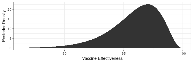
# posterior moderna
cases_treatment <- 5
cases_control <- 95 - cases_treatment
theta_ci <- qbeta(c(.025,.975),cases_treatment+.700102,cases_control+1)
rate_ratio_ci <- theta_ci / (1-theta_ci)
# effectiveness
100 * (1 - rate_ratio_ci)
xx2 <- (1:90)/500
yy2 <- sapply(xx2, function(x) dbeta(x,cases_treatment+.700102,cases_control+1))
xx2 <- 100 * (1 - xx2 / (1 - xx2))
ggplot() +
geom_area(aes(x=xx2,y=yy2)) +
theme_bw() +
xlab("Vaccine Effectiveness") +
ylab("Posterior Density")
df <- rbind(
data.frame(xx=xx,yy=yy,Company="Pfizer-Biontech (bound)"),
data.frame(xx=xx1,yy=yy1,Company="Pfizer-Biontech (point)"),
data.frame(xx=xx2,yy=yy2,Company="Moderna")
)
ggplot(df) +
geom_area(aes(x=xx,y=yy,fill=Company),alpha=.25,position = "identity") +
geom_line(aes(x=xx,y=yy,color=Company),size=1) +
theme_bw() +
xlab("Vaccine Effectiveness") +
ylab("Posterior Density")
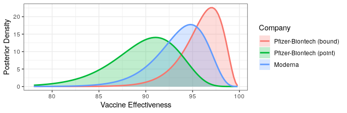
The likelihood that Moderna has higher or lower efficacy compared to Pfizer depends on the Pfizer press release interpretation. Regardless, both show fantastic levels of protection. Additionally, Moderna reported some safety data.
A review of solicited adverse events indicated that the vaccine was generally well tolerated. The majority of adverse events were mild or moderate in severity. Grade 3 (severe) events greater than or equal to 2% in frequency after the first dose included injection site pain (2.7%), and after the second dose included fatigue (9.7%), myalgia (8.9%), arthralgia (5.2%), headache (4.5%), pain (4.1%) and erythema/redness at the injection site (2.0%). These solicited adverse events were generally short-lived. These data are subject to change based on ongoing analysis of further Phase 3 COVE study data and final analysis.
To my eye, these also look fantastic. Based on my personal experience, they appear to be in the same ballpark as a flu shot. None of them are anything I'd mind experiencing yearly or twice yearly. Notably absent from this list is fever, which appears to be relatively common in other candidates and could really put a damper on vaccine uptake.
Another pressing question is whether the vaccines protect one from getting severe disease. Moderna found 11 severe cases among the control vs 0 in the treatment. This number is significantly lower, but should be interpreted with care. Given that the vaccine is effective, the pressing question is whether subjects are less likely to get severe disease given that they become infected. That is to say, in addition to preventing infections, does the vaccine make it milder if you do get infected?
> x <- matrix(c(0,5,11,90-11),nrow=2)
> x
     [,1] [,2]
[1,]    0   11
[2,]    5   79
> fisher.test(x)

	Fisher's Exact Test for Count Data

data:  x
p-value = 1
alternative hypothesis: true odds ratio is not equal to 1
95 percent confidence interval:
 0.00000 8.88491
sample estimates:
odds ratio
         0
0 of the five cases in the treatment group were severe, vs 11 of the 90 in the placebo. This is certainly trending in the right direction, but is not even in the neighborhood of significance yet (Fisher's test p-value = 1).