Categories
Deducer R

Updates to the Deducer family of packages

Over the past month there have been a number of package updates in the deducer ecosystem. Deducer is a general purpose, extensible, data analysis GUI. It is designed to be a free easy to use alternative to proprietary data analysis software such as SPSS, JMP, and Minitab. It has a menu system to do common data manipulation and analysis tasks, and an excel-like spreadsheet in which to view and edit data frames.

More information is available in the online manual:

http://www.deducer.org/pmwiki/pmwiki.php?n=Main.DeducerManual

And there is an intro video in youtube:

Deducer 0.6-3

The main change in Deducer 0.6-3 is an update to the (award winning) Plot Builder GUI to make use of the new features in ggplot2 0.9-0.

New plot builder features: Part 1

New plot builder features: Part 2

DeducerSpatial 0.4

A Deducer plug-in for spatial data analysis. Includes The ability to plot and explore open street map and Bing satellite images. Currently there is not much here in terms of heavy data analysis, but there are some great tools for importing and exploring spatial data.

DeducerPlugInScaling 0.1-0

A Deducer plug-in for factor analysis, reliability analysis and discriminant analysis.

Version 0.1-0 includes some general improvements as well as a dialog for linear discriminant analysis (thanks to Helios De Rosario-Martinez).

http://www.deducer.org/pmwiki/pmwiki.php?n=Main.LinearDiscriminantAnalysis

DeducerExtras 1.5

Added functionality for Deducer. This package includes additional dialogs for calculating distribution function values, cluster analysis, and more.

Version 1.5 includes some general improvements along with a new dialog implementing Friedman’s test, and Kendall’s W test (thanks to Helios De Rosario-Martinez).

http://www.deducer.org/pmwiki/pmwiki.php?n=Main.RankingAnalysis
Categories
OpenStreetMap R Spatial

Plot maps like a boss

A new package OpenStreetMap has been released to CRAN this week which is designed to allow you to easily add satellite imagery, or open street maps to your plots. Raster maps are a great way to add context to your spatial data with a minimum outlay of effort.

The syntax in OpenStreetMap is fairly simple, just give it a bounding box in lat/long and it will download a high quality raster image ready for plotting


library(OpenStreetMap)
library(rgdal)
map plot(map)


(click for higher quality image)

The above code downloads multiple map tiles and stitches together, with the level of zoom determined automatically. Unlike RGoogleMaps no files are created or stored on the hard drive. The plot gets is images from the mapnik server, which can provide street level information. In my opinion, there rendering looks pretty clean as well.

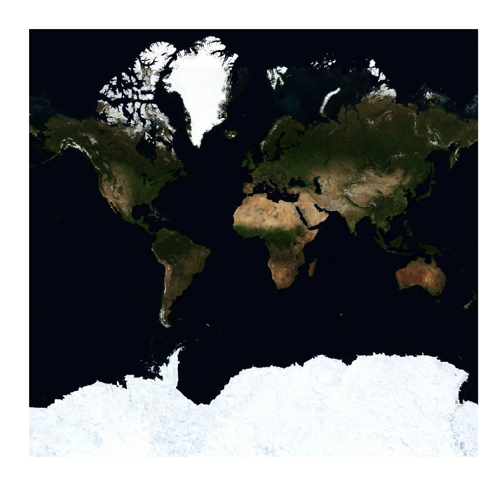
We can also access satellite imagery though Bing.


map plot(map)

Now, that is all fine and dandy, but kind of useless unless you are able to combine it with your own data. Open street map, and Bing (and Google maps) use a particular form of the Mercator projection which has the properties that angles are preserved, and tiles on multiple zoom levels can be stitched together. You can access this projection with the ‘osm’ function.

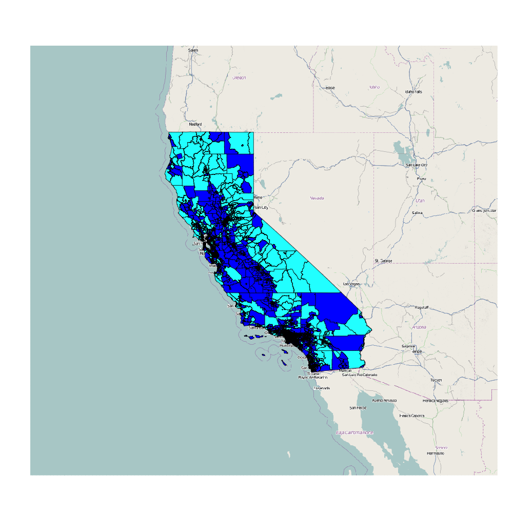
In terms of combining maps with your data there are two options. The data can be transformed to the osm() projection, or the raster map can be translated to whatever projection the data are in. Here is an example of the first option:

library(UScensus2000)
data(california.tract)
lat lon southwest california.tract plot(southwest)
plot(california.tract,add=TRUE,col=(california.tract@data$med.age>40)+4)

Here we take a map from the UScensus2000 package, transform it to mercator coordinates, and make a choropleth. The spTransform function is a great easy way to project your data into different map coordinate systems.

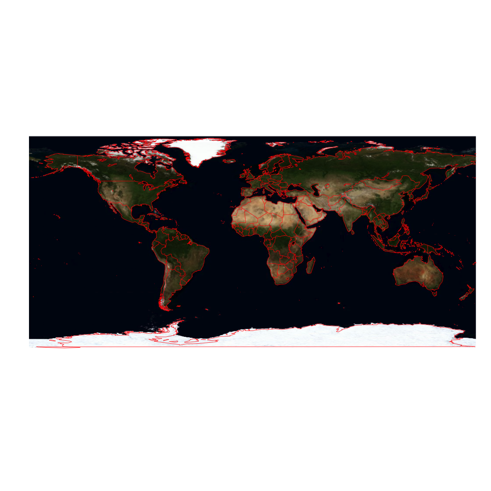
We may also want to go the other way and transform the image. The openproj function can transform open street maps to different projections. Here is an example combining OpenStreetMap with the maps library by projecting the map into longlat coordinates.

map map_longlat plot(map_longlat,raster=TRUE)
map("world",col="red",add=TRUE)

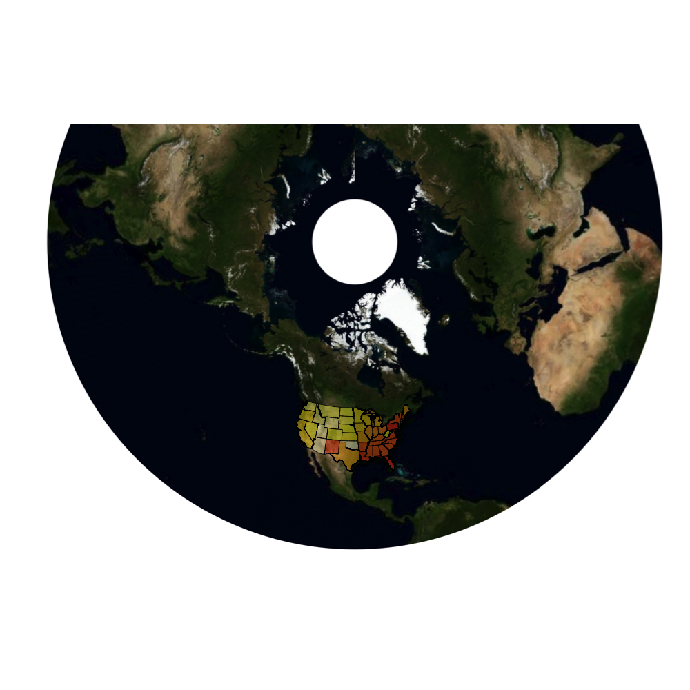
but, we are not just limited to the longlat projection, we can also do weirder ones like the lambert conic conformal.

map c(40,179),zoom=2,type='bing')
map_longlat #Lambert Conic Conformal (takes some time...)
map_llc "+proj=lcc +lat_1=33 +lat_2=45 +lat_0=39 +lon_0=-96")
plot(map_llc,raster=TRUE)
#add choropleth
data(states)
st_llc plot(st_llc,add=T,col=heat.colors(48,.4)[slot(st_llc,"data")[["ORDER_ADM"]]])

Now, I have no idea why you would want to use this projection, but it is pretty cool none the less.

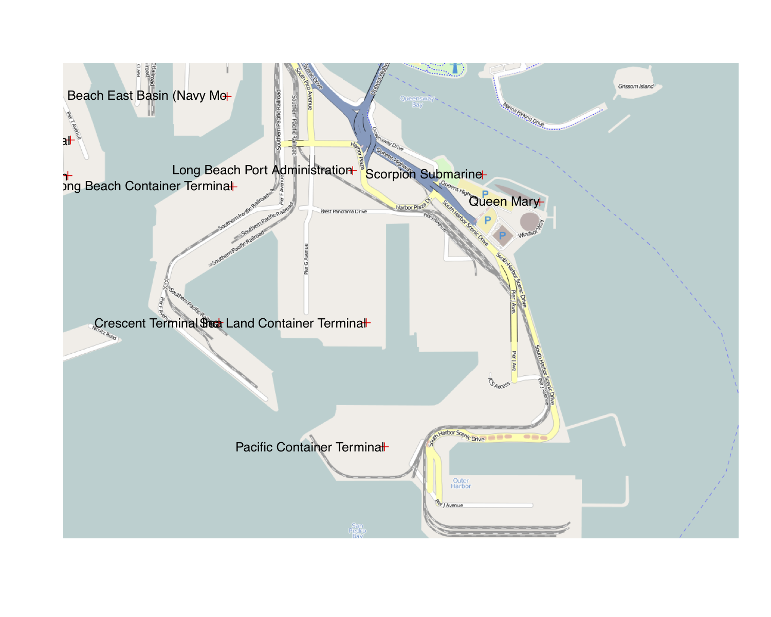
One of the best uses for raster maps is in street level data, where it is particularly important to give the reader contextual information. Here is a plot of some locations in the Long Beach harbor, using the LA_places dataset.

data(LA_places)
xy map c(33.73290566922855,-118.17521095275879))
png(width = 1000, height = 1000)
plot(map,raster=TRUE)
plot(LA_places,add=TRUE,col="red")
text(xy[,1],xy[,2],slot(LA_places,"data")[,'NAME'],adj=1)

If you are a Deducer user, the DeducerSpatial package provides a GUI for spatial plotting using the OpenStreetMap package.

Categories
wordcloud

Beat me to it

So as a follow-up to the last post about the 2010-11 state of the union addresses, I was going to compare the 2011 to the new 2012 speech. It looks like Simply Statistics beat me to it, which is very gratifying. No need to do the work myself 🙂

Categories
R wordcloud

Words in Politics: Some extensions of the word cloud

The word cloud is a commonly used plot to visualize a speech or set of documents in a succinct way. I really like them. They can be extremely visually pleasing, and you can spend a lot of time perusing over the words gaining new insights.

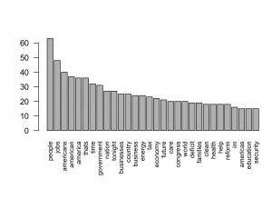
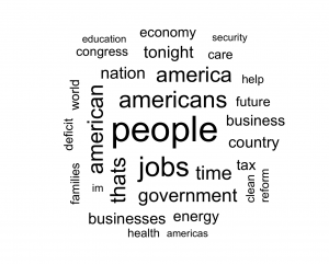
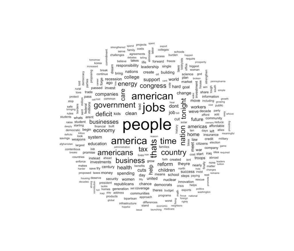
That said, they don’t convey a great deal of information. From a statistical perspective, a word cloud is equivalent to a bar chart of univariate frequencies, but makes it more difficult for the viewer to estimate the relative frequency of two words. For example, here is a bar chart and word cloud of the state of the union address for 2010 and 2011 combined.

Bar chart of the state of the union addresses for 2010-11
word cloud of the state of the union addresses for 2010-11

Notice that the bar chart contains more information, with the exact frequencies being obtainable by looking at the y axis. Also, in the word cloud the size of the word both represents the frequency, and the number of characters in the word (with longer words being bigger in the plot). This could lead to confusion for the viewer. We can therefore see that from a statistical perspective that the bar chart is superior.

… Except it isn’t ….

The word cloud looks better. There is a reason why every infographic on the web uses word clouds. It’s because they strike a balance of presenting the quantitative information, while keeping the reader interested with good design. Below I am going to present some extensions of the basic word cloud that help visualize the differences and commonalities between documents.

The Comparison Cloud

The previous plots both pooled the two speeches together. Using standard word clouds that is as far as we can go. What if we want to compare the speeches? Did they talk about different things? If so, are certain words associated with those subjects?

This is where the comparison cloud comes in.

Comparison plot

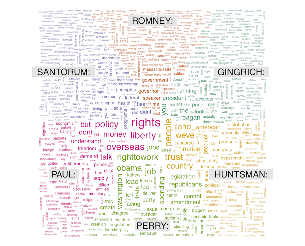
Word size is mapped to the difference between the rates that it occurs in each document. So we see that Obama was much more concerned with economic issues in 2010, and in 2011 focused more on education and the future. This can be generalized fairly naturally. The next figure shows a comparison cloud for the republican primary debate in new hampshire.

One thing that you can notice in this plot is that Paul, Perry and Huntsman have larger words than the top tier candidates, meaning that they deviate from them mean frequencies more. On the one hand this may be due to a single minded focus on a few differentiating issues (..couch.. Ron Paul), but it may also reflect that the top tier candidates were asked more questions and thus focused on a more diverse set of issues.

The Commonality Cloud

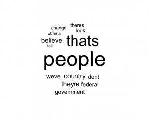
Where the comparison cloud highlights differences, the commonality cloud highlights words common to all documents/speakers. Here is one for the two state of the union addresses.


Commonality cloud for the 2010-11 SOTU

Here, word size is mapped to its minimum frequency across documents. So if a word is missing from any document it has size=0 (i.e. it is not shown). We can also do this on the primary debate data…

Republican primary commonality cloud

From this we can infer that what politicians like more than anything else is people 🙂


 The wordcloud package

Version 2.0 of wordcloud (just released to CRAN) implements these two types of graphs, and the code below reproduces them.

library(wordcloud)
library(tm)
data(SOTU)
corp <- SOTU
corp <- tm_map(corp, removePunctuation)
corp <- tm_map(corp, tolower)
corp <- tm_map(corp, removeNumbers)
corp <- tm_map(corp, function(x)removeWords(x,stopwords()))

term.matrix <- TermDocumentMatrix(corp)
term.matrix <- as.matrix(term.matrix)
colnames(term.matrix) <- c("SOTU 2010","SOTU 2011")
comparison.cloud(term.matrix,max.words=300,random.order=FALSE)
commonality.cloud(term.matrix,random.order=FALSE)

library(tm)
library(wordcloud)
library(stringr)
library(RColorBrewer)
repub <- paste(readLines("repub_debate.txt"),collapse="\n")
r2 <- strsplit(repub,"GREGORY\\:")[[1]]
splitat <- str_locate_all(repub,
	"(PAUL|HILLER|DISTASOS|PERRY|HUNTSMAN|GINGRICH|SANTORUM|ROMNEY|ANNOUNCER|GREGORY)\\:")[[1]]
speaker <- str_sub(repub,splitat[,1],splitat[,2])
content <- str_sub(repub,splitat[,2]+1,c(splitat[-1,1]-1,nchar(repub)))
names(content) <- speaker
tmp <- list()
for(sp in c("GINGRICH:"  ,"ROMNEY:"  ,  "SANTORUM:","PAUL:" ,     "PERRY:",     "HUNTSMAN:")){
	tmp[sp] <- paste(content[sp==speaker],collapse="\n")
}
collected <- unlist(tmp)

rcorp <- Corpus(VectorSource(collected))
rcorp <- tm_map(rcorp, removePunctuation)
rcorp <- tm_map(rcorp, removeNumbers)
rcorp <- tm_map(rcorp, stripWhitespace)
rcorp <- tm_map(rcorp, tolower)
rcorp <- tm_map(rcorp, function(x)removeWords(x,stopwords()))
rterms <- TermDocumentMatrix(rcorp)
rterms <- as.matrix(rterms)
comparison.cloud(rterms,max.words=Inf,random.order=FALSE)
commonality.cloud(rterms)


Link to republican debate transcript


Categories
Deducer R Video

A Spatial Data Analysis GUI for R

I am excited to announce the addition of DeducerSpatial to the Deducer plug-in ecosystem. DeducerSpatial is a graphical user interface for the visualization and analysis of spatial data, built on Deducer’s plug-in platform. In a previous post I illustrated how to user DeducerSpatial from the command line to add Open Street Map images to your R plots. In the video below, I provide a quick tour of the GUI.

To try it out for yourself:

  1. Install Deducer (Instructions)
  2. Open JGR
  3. Enter the following into the console: install.packages(“DeducerSpatial”,,”http://cran.r-project.org”)
  4. Once DeducerSpatial is loaded ( library(DeducerSpatial) ), you can type data(states) or data(LA_places) to bring in some data to play around with.


video link


Categories
Deducer JGR R Uncategorized Video

Reading Excel data is easy with JGR and XLConnect

Despite the fact that Excel is the most widespread application for data manipulation and (perhaps) analysis, R’s support for the xls and xlsx file formats has left a lot to be desired. Fortunately, the XLConnect package has been created to fill this void, and now JGR 1.7-8 includes integration with XLConnect package to load .xls and .xlsx documents into R.

Not fancy, but very useful.

Categories
R Uncategorized

Normality tests don’t do what you think they do

Last week a question came up on Stack Overflow about determining whether a variable is distributed normally. Some of the answers reminded me of a common and pervasive misconception about how to apply tests against normality. I felt the topic was general enough to reproduce my comments here (with minor edits).

Misconception: If your statistical analysis requires normality, it is a good idea to use a preliminary hypothesis test to screen for departures from normality.

Shapiro’s test, Anderson Darling, and others are null hypothesis tests against the the assumption of normality. These should not be used to determine whether to use normal theory statistical procedures. In fact they are of virtually no value to the data analyst. Under what conditions are we interested in rejecting the null hypothesis that the data are normally distributed? I, personally, have never come across a situation where a normal test is the right thing to do. The problem is that when the sample size is small, even big departures from normality are not detected, and when your sample size is large, even the smallest deviation from normality will lead to a rejected null.

Let’s look at a small sample example:

> set.seed(100)
> x <- rbinom(15,5,.6)
> shapiro.test(x)

Shapiro-Wilk normality test

data: x
W = 0.8816, p-value = 0.0502

> x <- rlnorm(20,0,.4)
> shapiro.test(x)

Shapiro-Wilk normality test

data: x
W = 0.9405, p-value = 0.2453

In both these cases (binomial and lognormal variates) the p-value is > 0.05 causing a failure to reject the null (that the data are normal). Does this mean we are to conclude that the data are normal? (hint: the answer is no). Failure to reject is not the same thing as accepting. This is hypothesis testing 101.

But what about larger sample sizes? Let’s take the case where there the distribution is very nearly normal.

> library(nortest)
> x <- rt(500000,200)
> ad.test(x)

Anderson-Darling normality test

data: x
A = 1.1003, p-value = 0.006975

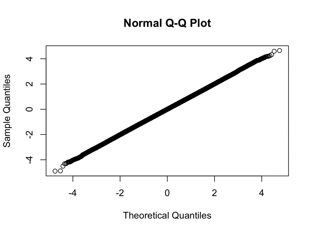
> qqnorm(x)
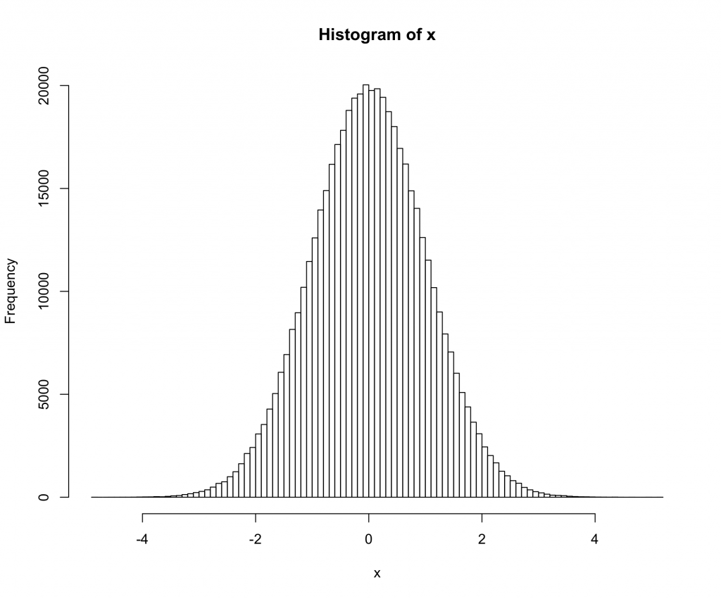
> hist(x,breaks=100)


Here we are using a t-distribution with 200 degrees of freedom. The qq and histogram plots show the distribution is closer to normal than any distribution you are likely to see in the real world, but the test rejects normality with a very high degree of confidence.

Does the significant test against normality mean that we should not use normal theory statistics in this case? (Another hint: the answer is no 🙂 )

Categories
R Uncategorized

Installing rgdal on a Mac

So, installing rgdal, which is an important R package for spatial data analysis can be a bit of a pain on the mac. Here are two ways to make it happen.


The Easy Way
  1. In R run: install.packages(‘rgdal’,repos=”http://www.stats.ox.ac.uk/pub/RWin“)
The Hard Way
  1. Download and install GDAL 1.8 Complete and  PROJ framework v4.7.0-2   from: http://www.kyngchaos.com/software/frameworks%29
  2. Download the latest version of rgdal from CRAN. Currently 0.7-1
  3. Run Terminal.app, and in the same directory as rgdal_0.7-1.tar.gz run:


R CMD INSTALL --configure-args='--with-gdal-config=/Library/Frameworks/GDAL.framework/Programs/gdal-config --with-proj-include=/Library/Frameworks/PROJ.framework/Headers --with-proj-lib=/Library/Frameworks/PROJ.framework/unix/lib' rgdal_0.7-1.tar.gz


Categories
Uncategorized

A Titan

Another titan of computer science died yesterday. Dennis Richie, father of C and UNIX passed away at 70. I enjoyed this post by Herb Sutter which gives an idea of the scale of cognitive leap that he had to make in order to think that he could make a universal programming language competitive with platform specific assembly.

For me it begs the modern question: Is it possible to build a dynamic modern programming language (ala Python, Ruby, R, etc.) that performs competitively with C? Most examples that I can think off are of by two orders of magnitude.

Categories
Deducer R Uncategorized

Open Street maps

There have been some exciting developments in the Deducer ecosystem over the summer which should go into CRAN release in the next few months. Today I’m going to give a quick sneak peek at an Open Street Map – R connection with accompanying GUI. This post will just show the non-GUI components.

The first part of the project was to create a way to download and plot Open Street Map data from either Mapnik or Bing in a local R instance. Before we can do that however, we need to install DeducerSpatial.

install.packages(c("Deducer","sp","rgdal","maptools"))
install.packages("UScensus2000")

#get development versions
install.packages(c("JGR","Deducer"),,"http://rforge.net",type="source")
install.packages("DeducerSpatial",,"http://r-forge.r-project.org",type="source")

Note that you will need rgdal. And you will need your development tools to install the development versions of JGR, Deducer and DeducerSpatial.

Plot an Open Street Map Image

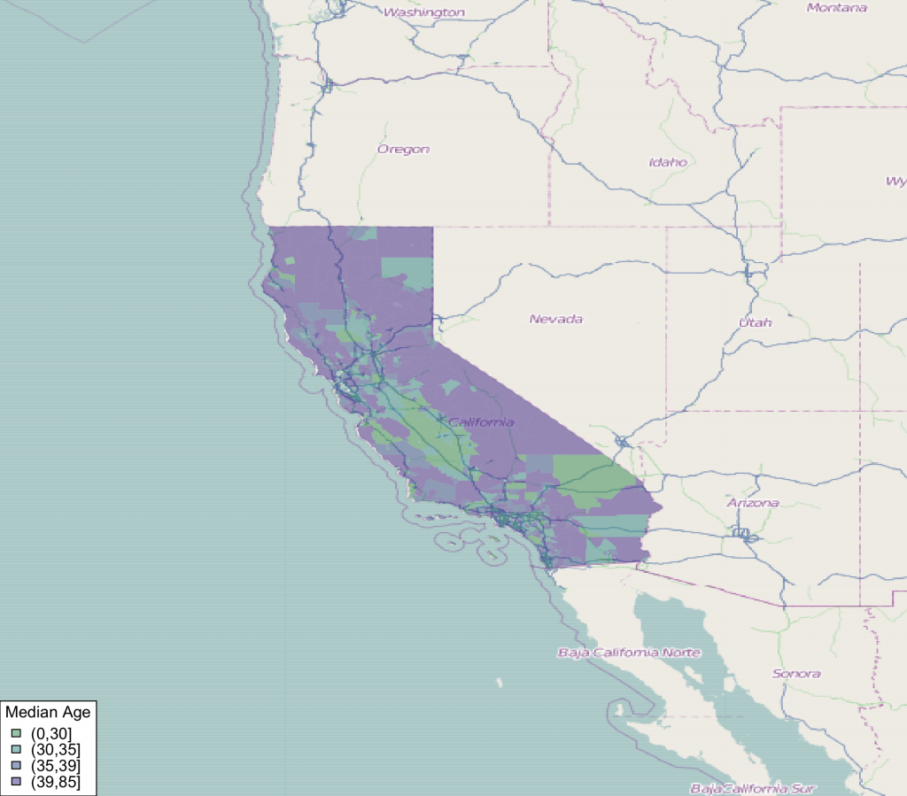
We are going to take a look at the median age of households in the 2000 california census survey. First, lets see if we can get the open street map image for that area.


#load package
library(DeducerSpatial)
library(UScensus2000)

#create an open street map image
lat <- c(43.834526782236814,30.334953881988564)
lon <- c(-131.0888671875  ,-107.8857421875)
southwest <- openmap(c(lat[1],lon[1]),c(lat[2],lon[2]),zoom=5,'osm')
plot(southwest,raster=FALSE)

Note that plot has an argument ‘raster’ which determines if the image is plotted as a raster image. ‘zoom’ controls the level of detail in the image. Some care needs to be taken in choosing the right level of zoom, as you can end up trying to pull street level images for the entire world if you are not careful.


Make a Choropleth Plot

Next, we can add a choropleth to the plot. We bring in the census data from the UScensus2000 package, and transform it to the mercator projection using spTransform.


#load in califonia data and transform coordinates to mercator
data(california.tract)
california.tract <- spTransform(california.tract,osm())

#add median age choropleth
choro_plot(california.tract,dem = california.tract@data[,'med.age'],
	legend.title = 'Median Age')


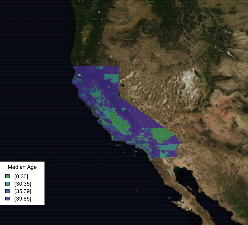
Use Aerial Imagery

We can also easily use bing satellite imagery instead.

southwest <- openmap(c(lat[1],lon[1]),c(lat[2],lon[2]),5,'bing')
plot(southwest,raster=FALSE)
choro_plot(california.tract,dem = california.tract@data[,'med.age'],alpha=.8,
	legend.title = 'Median Age')


One other fun thing to note is that the image tiles are cached so they do not always need to be re-downloaded.


> system.time(southwest <- openmap(c(lat[1],lon[1]),c(lat[2],lon[2]),zoom=7,'bing'))
   user  system elapsed
  9.502   0.547  17.166
> system.time(southwest <- openmap(c(lat[1],lon[1]),c(lat[2],lon[2]),zoom=7,'bing'))
   user  system elapsed
  9.030   0.463   9.169


Notice how the elapsed time in the second call is half that of the first one, this is due to caching.

This just scratches the surface of what is possible with the new package. You can plot any type of spatial data (points, lines, etc.) supported by the sp package so long as it is in the mercator projection. Also, there is a full featured GUI to help you load your data and make plots, but I’ll talk about that in a later post.